

I still remember the feeling. It was a few years back, and I'd just gotten my first case of The Monsters Mischief Diary series. Before I even looked at the box art, my eyes scanned for it. That simple, clean, all-caps word: LABUBU. Seeing it there, perfectly printed, slightly embossed on the cardboard, was a sigh of relief. It was real. It was official. The adventure could begin.
For those of us deep in the world of designer toys, a logo isn't just a logo. It's a seal of approval. It's a handshake from the artist. And in the case of the labubu logo, it's a quiet but powerful symbol that separates genuine art from the flood of fakes, and a mark that connects a massive global community of collectors. It's a detail that most people might overlook, but for us, it's everything.
The Logo as a Feeling, Not Just a Font
When you're searching for "labubu logo," you're probably getting a lot of dry articles about its history or vector files to download. That's fine, but it misses the point. It misses the feeling.
For a collector, that logo is the first touchpoint of the experience. It's the promise of what's inside the box. Kasing Lung's art is whimsical, mischievous, and full of heart. The logo, in its beautiful simplicity, doesn't try to compete with that. It steps back and acts as a frame for the art. It says, "What you're about to open is a genuine piece from this world."
Think about the unboxing ritual. You get your blind box. You check the shrink wrap. You admire the character art. And then your thumb runs over the logo. On the newer Pop Mart boxes, it's often slightly raised, a tactile little detail that feels premium. It's on the top, the sides, and the back. It's also on the little foil packet inside. And, most importantly, it's usually printed subtly on the figure itself, often on the bottom of a foot.
This repetition isn't just branding. It's a series of checkpoints. It's a ritual. Each time you see it, it reinforces the authenticity. I have customers who message me when they get their order, and the first thing they say is, "The boxes are perfect, the logo is so crisp!" They know what to look for.
This is something a generic article won't tell you. The labubu icon is part of the joy of collecting. It's the gatekeeper to the world of The Monsters. Without it, a figure is just a piece of vinyl. With it, it's a LABUBU.
Your First Line of Defense Against Fakes
Okay, let's get into the most practical reason you should be obsessed with the LABUBU logo: it's your best tool for sniffing out fakes. The counterfeit market for designer toys is massive and, honestly, heartbreaking. People spend good money thinking they're getting a real piece, only to receive a shoddy, low-quality knockoff.
Here's where your eye for the logo becomes a superpower.
Counterfeiters are lazy. They cut corners. And one of the hardest things to replicate perfectly is typography. I've seen hundreds of listings for fake LABUBUs, and the logo is almost always the first giveaway.
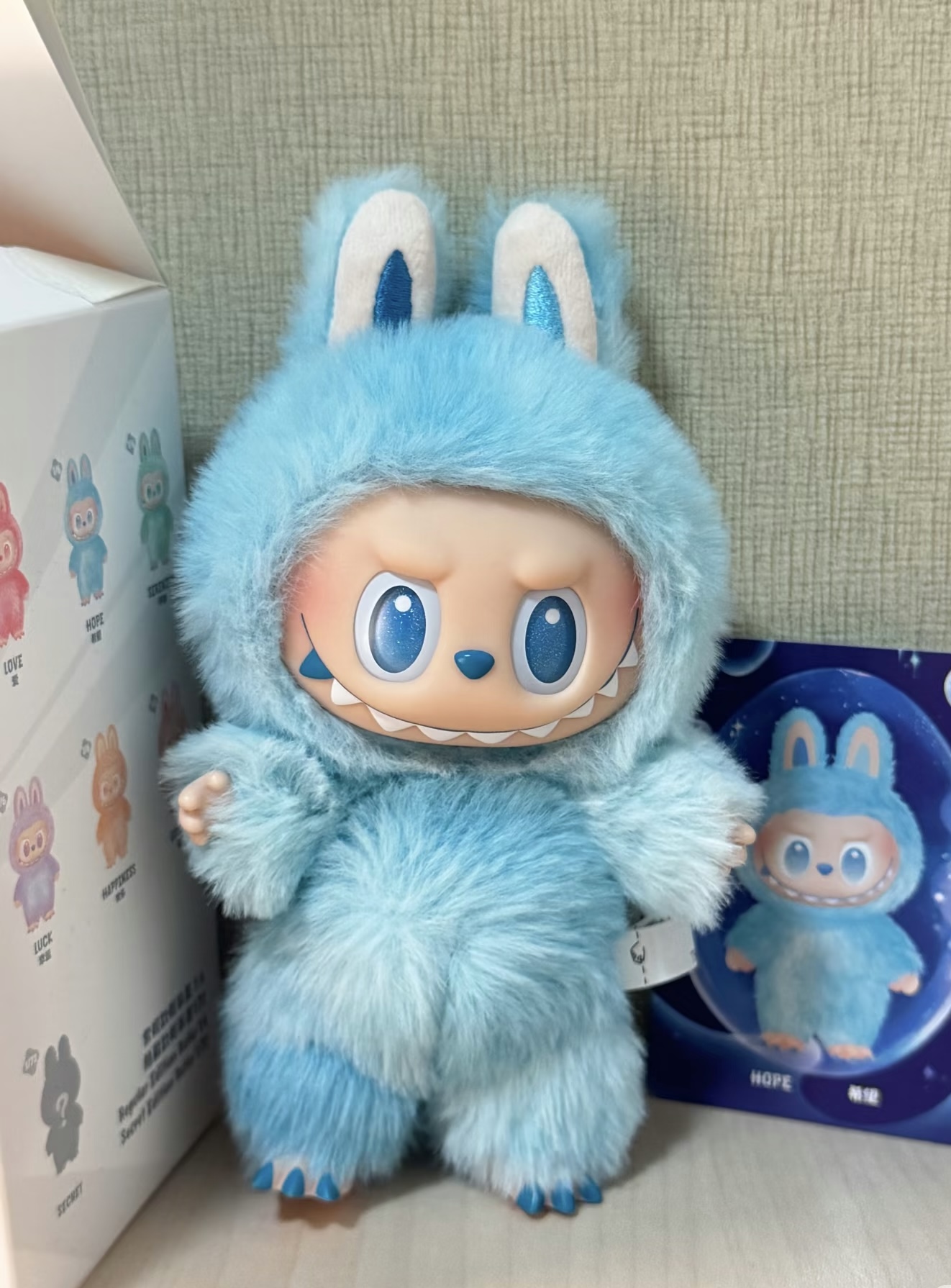
Here's what I've personally seen go wrong on fakes:
* Wrong Font Weight: The official LABUBU logo uses a very specific sans-serif font. Fakes often use a font that's too bold or too thin. The letters on a fake might look bloated or spindly. * Bad Kerning (Letter Spacing): This is the most common flaw. Look at the letters L-A-B-U-B-U. On a real product, the space between each letter is uniform and balanced. On fakes, the letters are often squished together or have weird, uneven gaps. The two 'B's are a great place to check; fakes often mess up the space around them. * Blurry or Pixelated Printing: Pop Mart's printing quality is top-notch. The logo on a real box is razor-sharp. If you see a logo that looks fuzzy, smudged, or like it was printed on a home inkjet from 2004, run. This is especially true for the tiny logo printed on the figure's foot. Fakes can't replicate that fine detail. * Incorrect Proportions: Sometimes the whole logo is stretched vertically or horizontally. It just looks… off. Your brain might not know why at first, but if you compare it to a photo of a real one, the difference is obvious.
I remember seeing a listing for a "deal" on The Monsters Macaron keychains. The price was too good to be true, which was the first red flag. I zoomed in on the seller's photo, and the logo on the little tag was a mess. The 'A' was too wide, and the 'U's looked like 'V's. Total fake. It's a lesson I try to pass on to every new collector: learn the logo. It will save you money and disappointment. It's particularly vital for the keychain craze, where fakes are rampant. As I've said before, buying a Labubu keychain without getting scammed requires a sharp eye for these exact details.
The Logo's Evolution, As Told By My Shelves
If you look at a LABUBU from 2017 and one from 2024, you'll notice the branding has evolved. The logo itself has remained fairly consistent, but its application and the surrounding branding have changed. This tells a story about the brand's growth.
My older figures, from before the massive Pop Mart partnership blew up, have simpler packaging. The logo is there, but it feels more like an indie project. The cardboard might be a bit thinner, the overall design less glossy.
Then came the Pop Mart era. The quality of everything skyrocketed. The boxes became sturdier, the finishes more complex (matte, gloss, foil accents), and the logo became part of a larger, more sophisticated branding system. You now have the Pop Mart logo, Kasing Lung's signature, and the LABUBU logo all working together.
One subtle thing I've noticed as a seller is the consistency of the logo's placement. On a full case of 12 blind boxes, every single logo will be in the exact same spot on every box. The alignment is perfect. This kind of manufacturing precision is expensive and it's another thing counterfeiters can't be bothered to replicate. I once got a case from a questionable supplier (early days, we all make mistakes!) and the logos on the boxes were all slightly off-center in different ways. That was my signal to never work with them again.
This evolution shows the journey from a niche artist's creation to a global phenomenon. And for collectors who have been around for a while, owning pieces from different eras is like having a physical timeline of LABUBU's history sitting on your shelf. Each logo tells a part of that story.
The "DIY" Logo Culture: When the Icon Becomes Art
One of the most fascinating things to come from the community is the way the labubu icon has been adopted and transformed by fans. When you see people searching for the logo file, they're not usually trying to make fakes. They're trying to make fan art.
I've seen it all: * Vinyl decals for cars and laptops. * Custom t-shirts and hoodies for collector meetups. * 3D-printed logos to use as display stands for figures. * Intricate fan art that incorporates the logo into the design. * Phone wallpapers and digital icons.
This is the ultimate sign of a brand's cultural impact. The logo has transcended its corporate purpose and become a piece of community identity. It's a badge that says, "I'm one of you." It's similar to how people use fan-made stickers to customize their world. In fact, the line between official and fan-made Labubu stickers is a whole world unto itself, driven by this same creative passion.
Of course, Pop Mart also recognizes this. They've released official merchandise that leans into the logo's power. There are tote bags, pins, and even some apparel where the LABUBU logo is the main design element, not a monster. They know that we don't just love the characters; we love the entire world, and the logo is the front door to that world. It's a simple, bold statement.
Real Talk: My Honest Take on the LABUBU Logo
Okay, so here's my seller/collector verdict. Honestly, the logo is almost aggressively simple. It's a clean, geometric, sans-serif typeface. There's no hidden arrow, no clever negative space, no complex graphical element. And that's why it's brilliant.
Kasing Lung's art is so expressive, so detailed, and so full of personality. A complicated logo would fight with it. The LABUBU logo has the quiet confidence to just be a name. It doesn't need to scream. It lets the monsters be the stars of the show. In a market saturated with loud, "look at me" branding, the labubu icon feels restrained and tasteful. It feels more like an artist's mark on a painting than a toy company's brand. It says, "This is a LABUBU," and that's all it needs to say. It trusts that the art will do the rest of the talking. And it always does.
So, the next time you get a new LABUBU, take an extra second to appreciate that logo. It's more than just letters on a box. It's your guarantee of quality, your shield against fakes, and your membership card to a club of people who just really, really love these weirdly wonderful little monsters.
Com/collections/labubu) here at PopNya. We check every detail, so you don't have to.
Disclosure: PopNya may earn a commission if you purchase through links on this page.


